
[New to Zentangle? Start here.]
This week, guest Zentangle Diva, Jen Crutchfield, CZT, challenged us to use color. This is kind of fortuitous because I’ve been using color quite a bit lately as I am on a mission to produce sea creatures in color for a giant collage I’m planning for our “down the shore” house in Brigantine, New Jersey. This is an over the top quite ambitious art project for me. Travel blogging is not quite as big a leap from recovering lawyer as artiste is. 😉
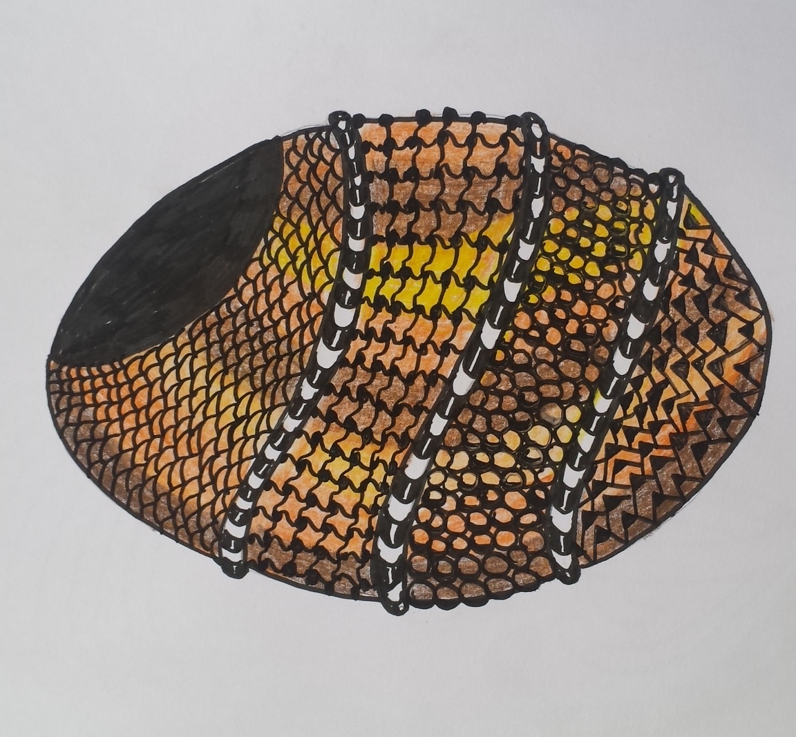
My latest, are some stylized mussels, using the tangle Bunzo:
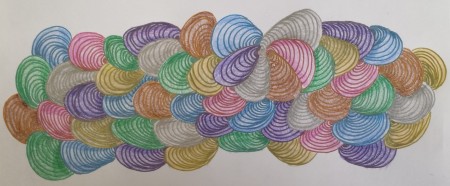
Stylized mussels first done with Gel-Xtreme .07 metallic pens and then colored pencils.
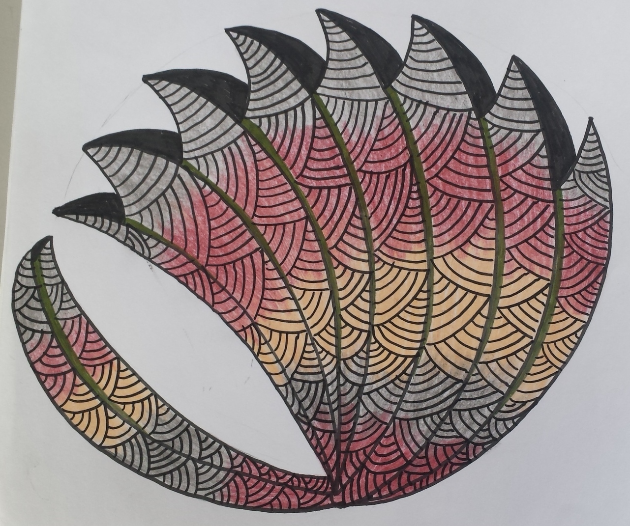
And some more mussels—-because you can never have too many mussels, right?
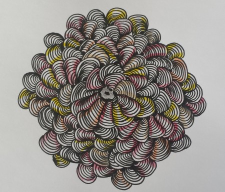
These were done first with a Graphic 1 Pigma Micron and then colored pencil.
Then, there are the fish:
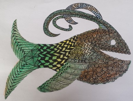
First, I colored the background with pencil and then used pigma micron marker on top.
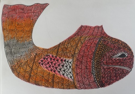
I’m not exactly sure what the next two are, but I’m pretty sure they dwell on the bottom.
I can use some crowd-sourcing assistance. What is a good media to use for background color? When I apply the color first and then ink over it, I end up ruining the pens because the pencils and water color paint, transfer to the pen tip (duh).

{ 34 comments… read them below or add one }
Lovely work, Suzanne! I like the first and the tile best because of their composition.
I meant to say: the first and the LAST one 😉
Suzanne, you make me crave the beach!! Your colors and mussels are really nice…I imagine they were especially soothing to work on. As for the color…I answered you on my blog, but the Copic markers worked well on top of the ink–I didn’t have any issues with bleeding, smudging, pen ruination (?) or the like.
You can never have too many seaside things, I adore your shells, the fish are great but a bit scary. Sorry I can’t offer background opinions, I haven’t tried any myself but would be interested in others answers for the future.
I like your different pictures!
Very great seaside pictures!
I love your bunzo mussles 🙂
I just love your seaside tiles. Each one is so different and yet captivating. If your pens are not liking what you’re using to color, try a Sharpie no-bleed fine point. They can handle just about anything.
Fabulous pieces. You’ve made the transition quite well I’d say! I second the markers as a background suggestion. You might be able to clean the nibs with a colorless marker.
If I had to chose I’d take the last one, but every tile is such great work!
The first mussels are colored lovely.
The second vibrate.
The fish are cute.
I like the yellow on the egg-shape.
Great work!
Nice work! I like your fish. I especially like the tile done with the Graphic 1 Microns!
Wow…are these beautiful! The first 2 really got my attention. I think it’s a combination of the composition and the color…love the color. And I just happen to love mussels too. Have no advice to offer – sorry – as I am admirer only. LOL This continues to fascinate me!
These are all beautiful and intricate! I love everything about sea life!
Love the colors on your Fish. Super cool !!
Wonderful pieces all! Especially I like the second one!
Wow, a lot of colorful pieces, love tehm, especially the fishes.
i don’t know nuthin’ bout birthin’ zentangles mizz Scarlett but I know what I like – and I love that first one, the colorful mussels!! The fish look like hard-core heavy duty work. These things are so cool!
LOL. It’s only work sometimes. Most of the time it’s fun and relaxing. 🙂
Like all your pieces. I have not done a lot or things like the fish or stenciling inside pictures. Are you familiar with Margaret Bremner’s tangle Cockles ‘N’ Mussels? Here is a link to her tangles. http://enthusiasticartist.blogspot.ca/p/my-tangles.html Will have to scroll down to it and then click on it to see step outs. I do not use a lot of color but when I have used as a wash have used watercolor pencils and then added water to spread them. There are other techniques. I think Alice Hendon at The Creator’s Leaf has some information about using alcohol inks. I have not tried but recently had something posted on the Stacked and Tangled FB page.
I love your last bottom dweller the best. The rest, especially the mussels are great too. But what about those of us born mid-1945? We have no group to belong to, so I just lie and tell everyone I’m a boomer too.
We’re not doctrinaire here at Boomeresque. As far as I’m concerned, you can be a Boomer too. 😉
Hi Suzanne, I love these. you are really on a roll. For background colour I have two suggestions which do not block your B/W pens:-
Alcohol markers, like Promarkers, Spectrum Noir, Copics etc, but they do bleed on the paper so you need to practise first.
Or, and these are becoming a favourite of mine, Sakura Koi water colour brushes. (Have a look at Joanne Fink’s blog.) Although water colour, they are inks rather than solid colour and therefore will blend and fade through really well. I love’em.
Oh, yes, couldn’t agree more, never have too many mussels.
These are wonderful!! What a great project – and like the way you show your changed words from over the top!! 🙂 I don’t know about the background. But they are all lovely!!
~ Diane Clancy
http://www.dianeclancy.com/blog/2015/07/my-diva-jen-crutchfield-2-color-challenge-entry
Lovely use of colour on your pieces. I really like the 2nd mussels piece and the way it grows out from the centre in particular 🙂
Wow, Suzanne, that’s a lot of beautiful art. The second one is my absolute favorite.
I love all your tiles. I think we must all be feeling colourful at the moment. If you want good lightfast backgrounds then Golden Paints – Fluid Acrylics and their new High Flow Acrylics ( these replace their airbrush colours which I still use) are just brilliant. In my post this week I used thin washes of the Fluid Acrylics. They dry quickly and my micron pens worked fine without clogging. You can use almost any media on too of them and I finished up with watercolour and graphite pencils. Hope this helps.
Thanks so much for the color advice.
That horne’d fish, with the grin, made me smile. And then I felt so sorry for the next one, who looks sad.
My favorite is the first one, with the simplicity of the pattern, and the serenity of the color palette. They all look like they were relaxing to create.
Oh…colored backgrounds. I used Derwent watercolor pencils on one. Put the color down, then wetted it with plain water and a little brush, let it dry. It didn’t affect my pens that I could notice. Gel ink does that every time
Your work is scrumptious! Those sea creatures are going to look fabulous in your beach dwelling…there’s nothing like your own creations for the walls of your home away from home. Color…so many possibilities out there that you are going to have fun trying. I read people’s suggestions in your comments and it’s interesting to see what they work with. This week Wayne and I did our work on prepped watercolor paper that our daughter did with washes, we are traveling and have a hard time taking too much with us. I often use colored pencils after doing the black pen work. The Derwent watercolors are great for coloring too…I touch down just a bit of water on the area that needs color and then add the color with the pencil and move it with a fine tipped watercolor brush. Identi-pens by Sakura are great for just about anything…but they aren’t fine tipped….the finer end is more like an 08…but if you are going larger or want something more bold they are great, they even work on glazed ceramic pieces and are super permanent. Would be nice to do some tutorials so you can see…I’m visual and that always helps me. Have fun!
Suzanne, I love the work you’ve done to decorate your shore house. The bunzo mussels are great! Wouldn’t know Brigantine in summer, only ever been in winter…Like you, I shy away from color. When I’ve used a watercolor/color wash background, it’s liquitex acrylics watered down and blobbed on watercolor paper..and left to be forgotten until found again. And from a Diva challenge many moons ago, I splattered coffee on watercolor paper, left to dry several days between blotter paper. That was fun! My attempt this week at color used colored pencils, which are bound with wax, so they go on last, otherwise they create a resist….too much art stuff, so little time!
Have a brilliant day! c
Absolutely great fun! I love all of them, even if I’m not quite sure what some of them are either. Lovely colours and a great idea and project. Axxx
I’m always in for a treat when I stop by your page. You don’t disappoint when it comes to a challenge with color. The first picture was incredible. And the other pieces were just inspired. Such a great mind you have! Sarah.
All fabulous and fun!
That last one is my favorite. But I enjoy all the shapes and colors.